The Breakdown, Episode 09: Vintage Beauty Shots
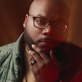
An inside look at the creative and technical decisions behind a vintage-inspired beauty story—from the first lighting choice to the final grade.
The Creative Intention
The goal was not to reproduce one specific era. We wanted to borrow the romance, polish, and dreamlike quality of classic beauty photography, then interpret it through our own point of view.
The visual world came from several decisions working together: sculptural hair, pastel makeup, reflective accessories, optical filtration, a cool color palette, and controlled softness throughout the final image.

A Simple Two-Light Setup
The setup only used two lights, but each source had a specific responsibility. The key shaped the face and established the overall exposure. The second light was not simply decoration—it was a product light designed to make the hair read with dimension, sheen, and separation.
Positioning and Feathering the Key
The Nanlite FC-720B was positioned roughly three feet to the model’s right and about two feet in front of her. This moved the source away from a flat, camera-axis beauty position and allowed the light to travel across the face with more shape.
I feathered the 60-inch softbox slightly instead of pointing its center directly at the model. Feathering meant she received the softer edge of the beam, which created a gentler wrap across the skin. It also controlled how the light continued past her, allowing some illumination to reach the backdrop without washing it evenly. That gradual falloff helped the subject feel connected to the environment while preserving depth behind her.
This is an important distinction: a large modifier does not automatically create dimensional soft light. Its position, angle, and the portion of the beam that reaches the subject determine whether the result feels sculpted or flat.
Treating the Hair Light as a Product Light
Because this was a hair campaign, the secondary light needed to do more than separate the model from the background. Its purpose was to reveal the sheen, volume, and surface movement of the hair—the qualities the campaign was created to sell.
An Amaran 300c with a Fresnel and barn doors gave us a concentrated highlight that could be directed onto the hair without flooding the entire set. We cycled through several colors during the shoot. Rather than maintaining one fixed numerical ratio, we adjusted the intensity by eye because different colors registered with different visual weight.
The target was a prominent highlight: bright enough to pull attention toward the hair and describe its texture, but restrained enough that it did not become the first or only thing the viewer noticed. That balance changed slightly with each color and hairstyle, so the ratio was treated as a responsive creative decision rather than a permanent setting.
Why I Chose ISO 800
The final exposure was approximately 1/200 second at f/3.5 and ISO 800. Choosing ISO 800 was part of the lighting strategy, not a compromise made after the fact.
Continuous lights behave differently from flash because their output must coexist with the ambient light already present in the room. At ISO 100, I would have needed significantly more fixture output—or a wider aperture or slower shutter speed—to reach the same exposure. ISO 800 placed the continuous sources and the ambient light within a more workable range, giving me greater control over their balance without forcing every other camera setting to serve the lights.
I also was not overly concerned about introducing objectionable noise. Modern digital cameras can perform cleanly at ISO values well beyond 800, often through ISO 3200 depending on the camera, exposure, and finishing. A properly exposed ISO 800 file was preferable to underexposing at a lower ISO and aggressively lifting the image later, which can reveal more unpleasant noise and color artifacts.
The larger lesson is that ISO should not always be treated as a number that must remain as low as possible. It is one of the tools available for balancing aperture, shutter speed, continuous-light output, ambient exposure, and the visual intention of the frame.
Working With the Nanlite FC-720B
Thank you to Nanlite for sending the FC-720B over for me to try. So far, I am enjoying both the power and the quality of light it produces. This shoot was a strong first test, and I plan to share a deeper look at the fixture in a future Breakdown.
Creating the Optical Character
The images were photographed with a Sony camera and Sigma 24–70mm f/2.8 lens. Prism Lens FX Moody FX and Dream FX ¼ filters softened the digital precision, bloomed the highlights, and gave reflective surfaces a more expressive glow.
The intention was not to make the photographs appear out of focus. It was to introduce romance, atmosphere, and a tactile softness before the files ever reached post-production.
The Grade
Most of the visual character was already created in camera, so the Capture One grade supported the image rather than reinventing it. I cooled the overall palette while protecting the warmth and life in the skin.
A silver-rich grain treatment added texture and worked with the lens filters to strengthen the glow and starburst effects. The grade completed a world that lighting, beauty, styling, and filtration had already established.
Why the Details Matter
Sculptural hair, pastel eye color, reflective jewelry, feathers, manicured hands, and controlled posing each gave the light something different to respond to. The vintage quality emerged through a collection of coordinated choices rather than one obvious period reference.

The Result
The final photographs sit somewhere between polished beauty and hazy memory. Soft light shaped the face, colored light created separation, and the filters and grade brought the entire visual language together.
A strong image does not always require a complicated setup. It requires a clear intention—and a team whose decisions support the same world.
The Final Images
The complete series reveals how the same visual language could hold across changes in hair, makeup, accessories, pose, and color. Each frame remains part of one world while giving the individual beauty looks their own presence.

Credits
Brand: @jritzyhaircollection
Photographer: @iamaferrell
Producer / Creative Direction: @jonnellchavez
Co-Producer + Stylist: @taylorm.lewis
Director of Photography / Editor: @buzztheshooter
Lighting / Grip: @cjbattle
First AC: @jennmissouri
Set Assistant: @earthtokaisha
MUA: @maryonthebeat
Hair: @babybangz504
Continue the Conversation
Which part of the process would you like to see explored next: the lighting, lens filters, or color grade?

Comments